A JioPC - Product Design Critique by Akshay Borhade
Apps
Information Architecture
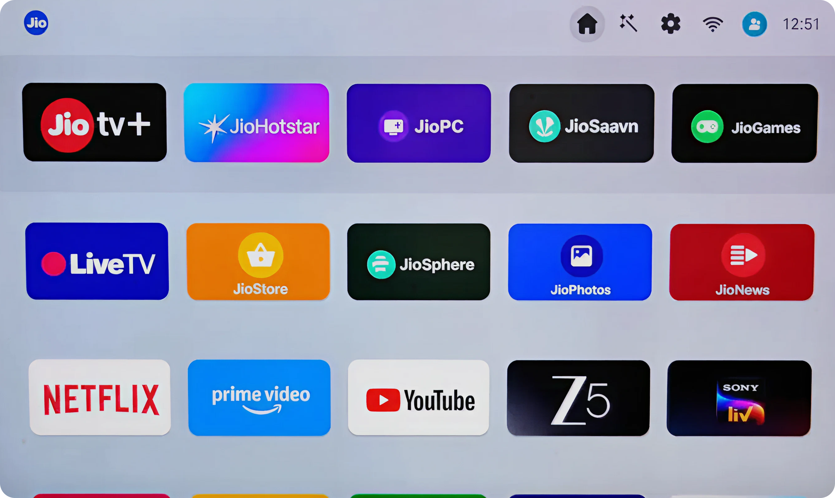
Current state
JioPC app buried among entertainment apps with no clear differentiation or prominence (the current border animation doesn't give a presence of JIO pc)
Impact:
Users mentally categorize STB as "entertainment device" missing productivity entry point. High drop-off before JioPC discovery.
Proposed Solution:
- Create dedicated "Productivity" row/ section in top of app Launcher
- JioPC card 2x larger than other apps with subtle glow/pulse animation
Visual Hierarchy
Current state
All apps have equal visual weight; JioPC doesn't signal "primary purpose transformation"
Impact:
Users scan horizontally without understanding JioPC's central role. Cognitive load in deciding "what to click"
Proposed Solution:
- Hero card layout for JioPC (top-center, full-width banner)
- Contextual tagline: "Transform your TV into a workstation"
- Recent activity badge (Last used 2h ago or Complete setup)
Interaction Design
Current state
No indication of JioPC's state (installed/not installed, setup complete/incomplete)
Impact:
Users don't know if clicking leads to app launch vs installation vs setup continuation
Proposed Solution:
- State indicators: Setup Required badge, Ready to Use checkmark, Update Available dot
- Micro-interaction: Card lifts + preview tooltip on hover
- Haptic feedback on remote button press
Cognitive Load
Current state
15+ apps visible with no guidance on "what's new" or "recommended action"
Impact:
Analysis paralysis: users default to familiar entertainment apps
Proposed Solution:
- Smart recommendations section: Suggested: Complete JioPC Setup
- Onboarding checklist progress: 2 of 3 steps complete
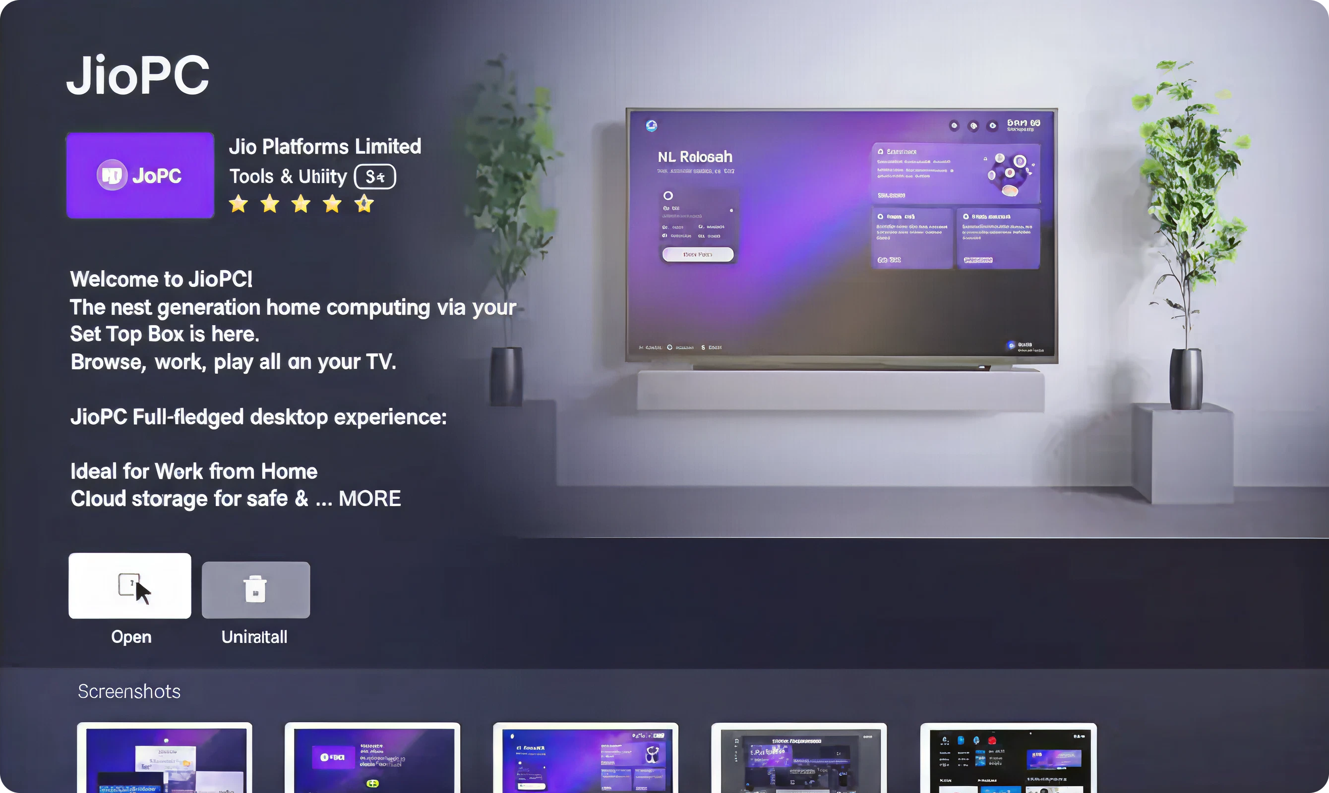
Information Architecture
Current state
Dense text block with competing CTAs ("Open" vs "Uninstall") and unclear value proposition hierarchy
Impact:
Users don't understand "what happens when I click Open"
Proposed Solution:
- Progressive disclosure: Show hero statement + single CTA first
- Secondary info (ratings, features) revealed on scroll/focus
- Remove "Uninstall" from primary screen (move to settings menu)
User Confidence
Current state
Generic "Welcome to JioPC" messaging without addressing user concerns
Impact:
Hesitation to proceed; users seek external validation (Google search, reviews)
Proposed Solution:
- Trust indicators: "Bank-grade encryption" icon, "Zero data stored locally" badge
- Performance preview: "Runs on 8GB RAM" spec callout
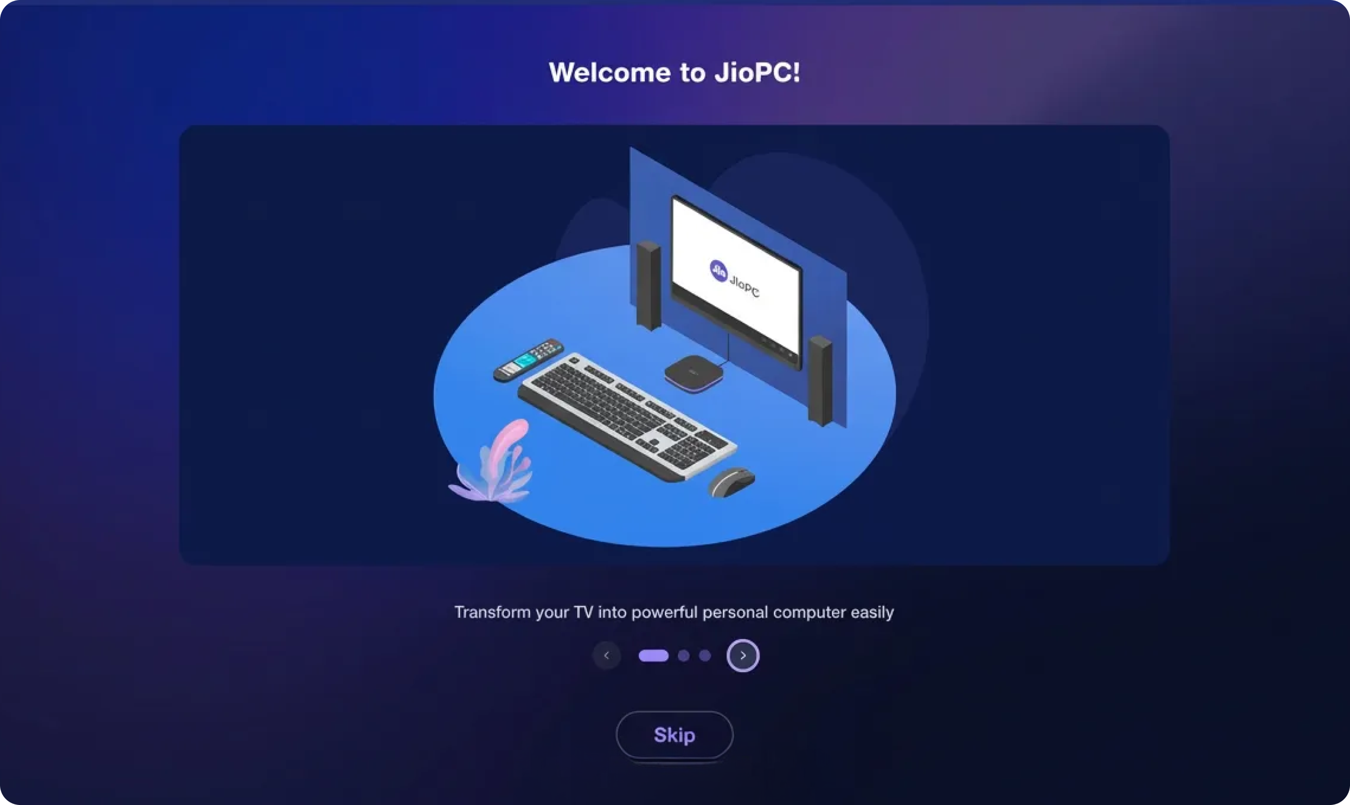
Visual Hierarchy
Current state
Illustration dominates screen; headline "Welcome to JioPC" lacks emotional resonance
Impact:
Generic welcome feels impersonal; users don't connect with "why this matters to me"
Proposed Solution:
- Personalized headline: "Hi [Name], Let's Transform Your TV" (pulls from Jio account)
- Value-driven subhead: "Work, learn, and earn from your living room"
- Custom Illustration or a Video which enacts the TV transformation, more whitespace around text
Interaction Design
Current state
Position of "Skip" and "Next" buttons provides equal visual weight; also unclear if skip means "exit" or "skip to dashboard"
Impact:
Users accidentally exit onboarding; re-entry friction increases abandonment
Proposed Solution:
- Remove "Skip" entirely from Step 1 (first impression critical)
- Progress dots: "1 of 3" with clickable navigation
Cognitive Load
Current state
Body text too verbose: "Transform your TV into powerful and creative workspace" (12 words)
Impact:
Users don't read; skip without understanding core value
Proposed Solution:
- Reduce to 5 words max: "Your TV. Now a workstation."
- Animated typed text effect: Words appear sequentially
- Voice narration option: Audio reinforces visual, like Apple's 'Hey Siri'/ Android 'Ok Google'
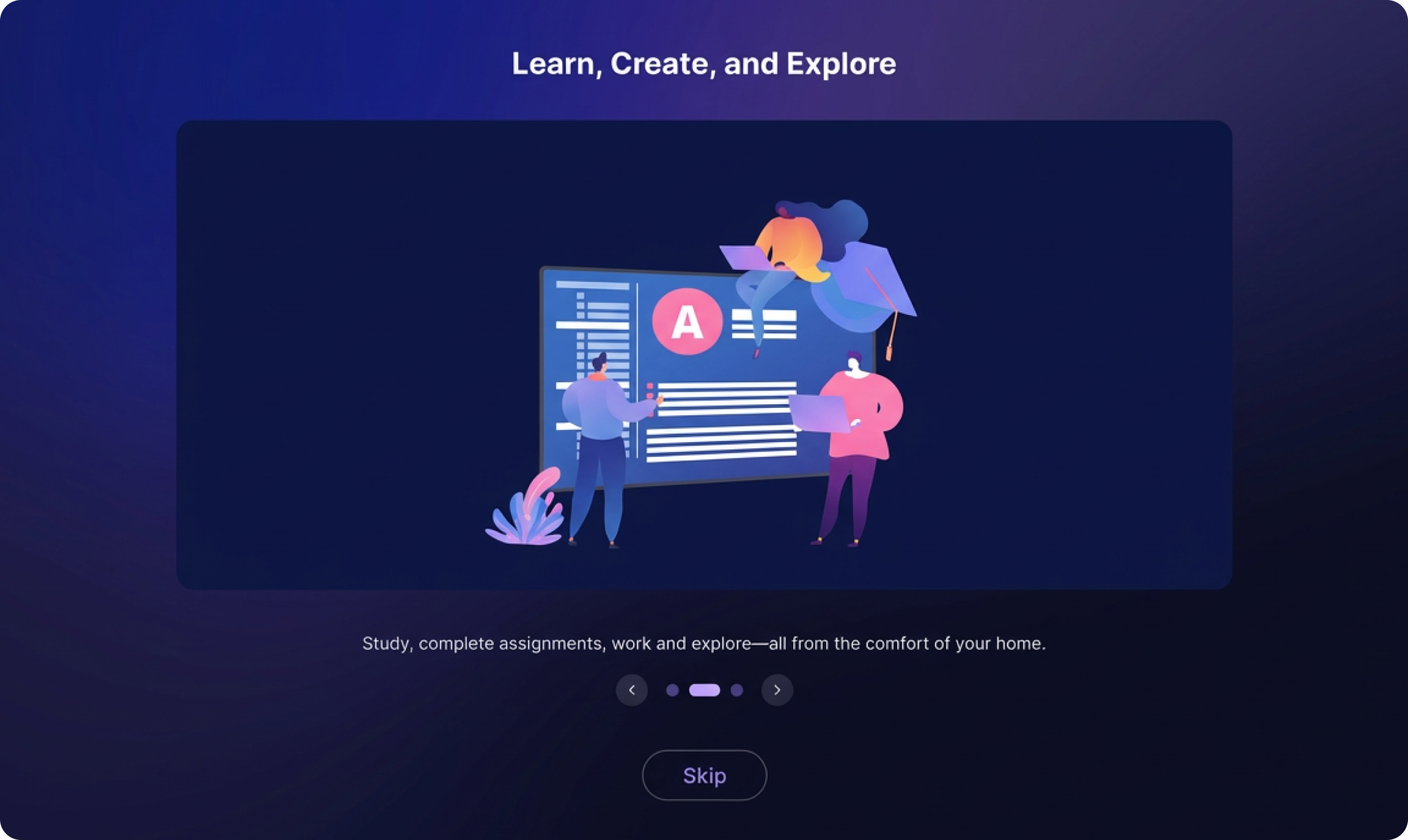
Information Architecture
Current state
Generic capabilities ("Study, create assignments, use AI") don't map to user's actual needs
Impact:
Features feel like marketing gimmick; no personal connection to use case
Proposed Solution:
- Persona-based messaging: Student? "Submit assignments from your couch" (figure out user persona through integrated jio products user data)
- Skip abstract illustrations; show actual JioPC interface screenshots
Visual Hierarchy
Current state
Illustration-heavy design buries the headline "Learn, Create, and Explore"
Impact:
Users focus on cartoon characters instead of action-oriented messaging
Proposed Solution:
- Flip layout: Text-first (left), illustration supporting (right)
- Animate text entrance and use of icon badges
User Confidence
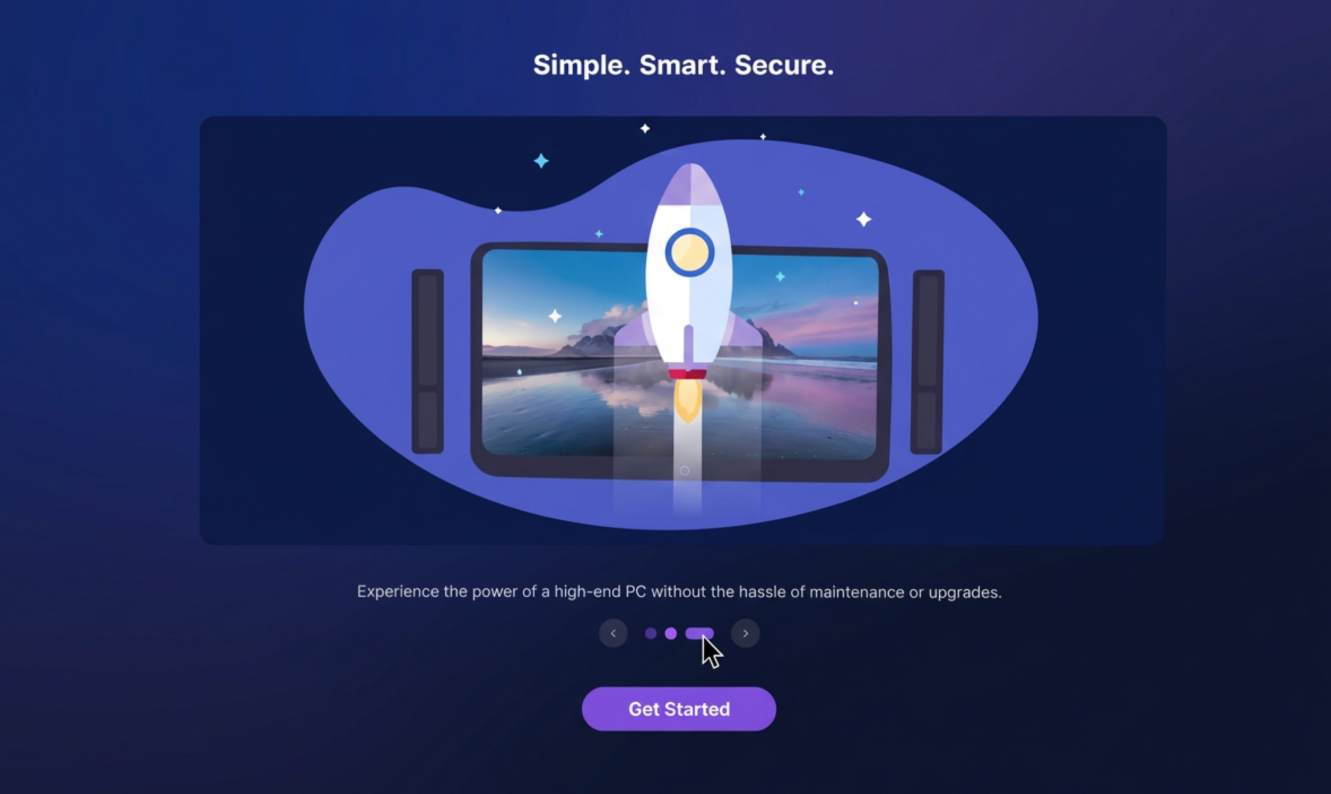
Current state
"Simple, Smart, Secure" is vague marketing speak; no proof points
Impact:
Security-conscious users (remote workers, business owners) skeptical of cloud computing safety
Proposed Solution:
- "End-to-end encrypted" with lock animation
- Live security demo: Show real-time encryption visualization
Jargon & Complexity
Current state
Usage of technical terms 'Hassle of maintenance', 'upgraded' without explanation
Impact:
Non-technical users (shop owners, students) don't understand value
Proposed Solution:
- Plain language: "Your files stay private. Updates happen automatically."
- Video explainer link: "How JioPC keeps you safe (60 sec)"
Interaction Design
Current state
"Get Started" button doesn't indicate next step (account creation? dashboard?)
Impact:
Anxiety about commitment; users hesitate to click
Proposed Solution:
- Action-specific label: "Create My Workspace" or "Complete Setup"
- Next: Pair your keyboard & mouse
- Progress indicator: Almost done: 1 more step
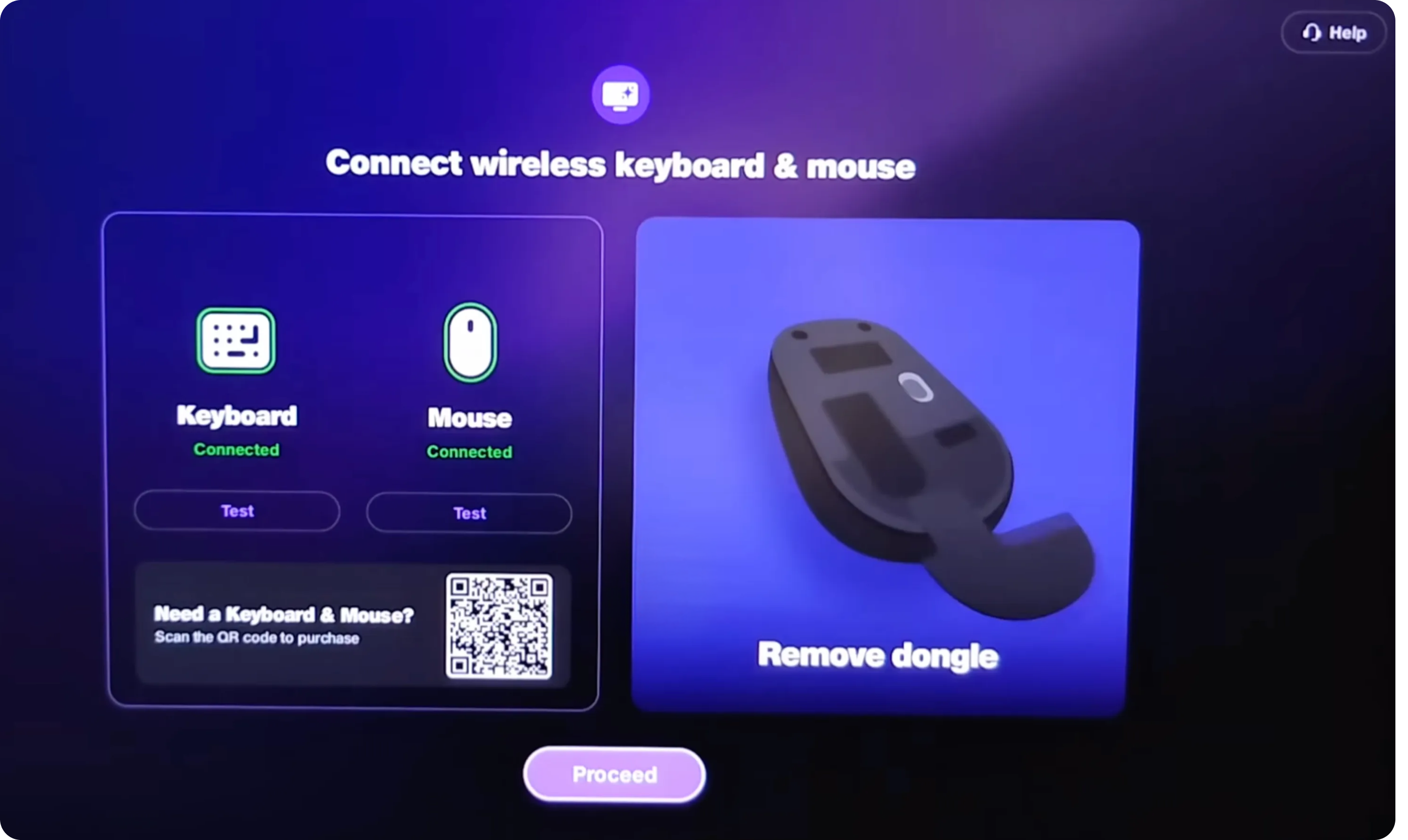
Product Placement
Current state
Mouse product image dominates. Only one type of dongle that comes out of mouse. Many mouse have dongle separately packaged
Impact:
"Do I need this specific mouse?"
Proposed Solution:
- Replace product photo with universal instructional diagram
- Focus on connection process for eg: Step 1: Turn on your mouse, Step 2: Press pairing button, Step 3: Select on TV
- Show info - compatible devices include... (multiple brands)
Misleading QR Code - False Promise
Current state
QR code shown with minimal context, do i need to buy specific mouse or keyboard? No trust indicators. Video tutorial shows Bluetooth pairing, but QR suggests purchasing hardware that isn't available.
Impact:
Users scan QR expecting to buy recommended hardware, land on irrelevant page, feel deceived. Immediate credibility loss at first touchpoint.
Proposed Solution:
- Business POV- E-commerce Integration
- User Experience - Remove E-commerce, Focus on Pairing
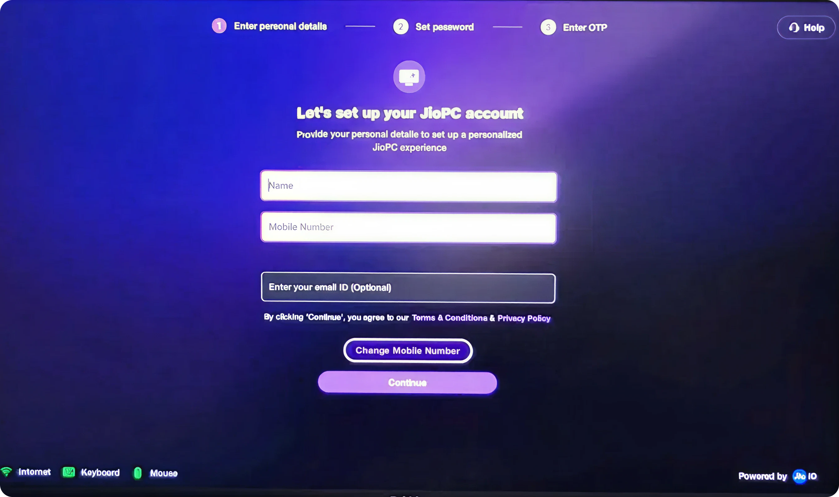
Cognitive Load - Manual Form Entry
Current state
All fields require manual entry even though users likely logged into Jio ecosystem on this device (JioTV, JioFiber, etc.). No auto-fill from existing Jio account. No smart defaults. Form feels tedious despite data already known by system.
Impact:
I'm already logged into Jio, why am I entering this again?" Perception of disjointed ecosystem (Jio services don't talk to each other).
Proposed Solution:
- If Jio account detected on device Modal appears: "Welcome back! We found your Jio account" Profile icon - Akshay Borhade, Mob no. - 8655309919, akshay@gmail.com, Jio account since 2021
- Two options: Use this account (Recommended) → One-click setup, all fields pre-filled
- Create new account → Falls back to manual form
Validation - Error Prevention
Current state
Real-time validation inconsistent or absent. Users complete entire form, click submit, then see errors - users uncertain if input correct until submission.
Impact:
User: Trial-and-error frustration. Mobile number format unclear, Email id input too overwhelming
Proposed Solution:
- States for fields : Neutral, Green border, Red border
- Acknowledge - Name must be at least 2 characters, Looks good!, Mobile should be 10 digits
- Email id domain dropdown or text input suggestion, @gmail.com, @yahoo.com, etc
Navigation - Back Button Trap
Current state
Go back button prominently placed alongside Sign up CTA.
Impact:
Go back provides easy escape route when form feels overwhelming.
Proposed Solution:
- Go back can be removed and affordance to go back should be on the setup step wizard
- Single confident CTA - Continue
- Auto-save form fields as user types (local storage)
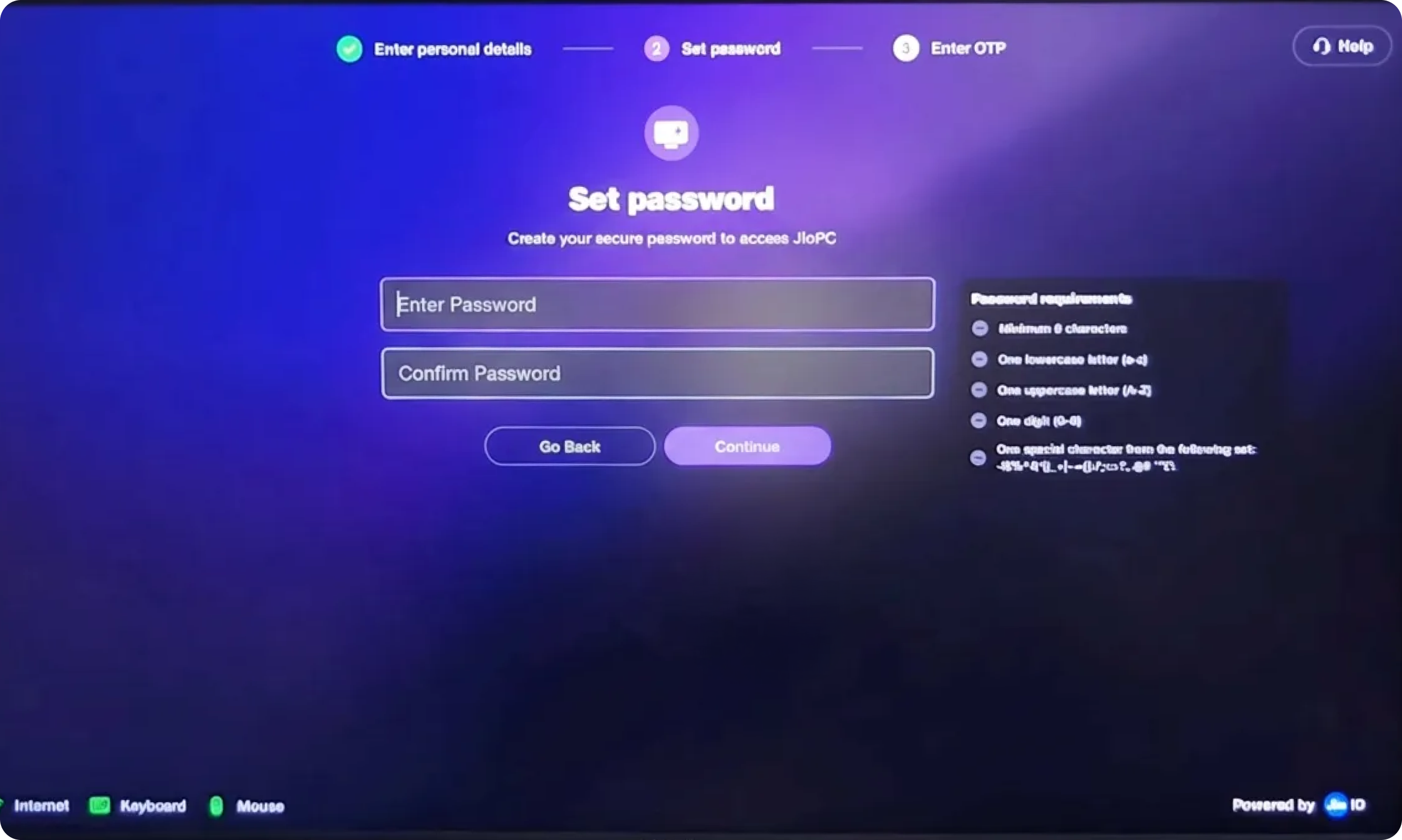
Password Visibility
Current state
Password field fully masked
Impact:
Blind typing anxiety. TV remote/keyboard typos more likely than phone/computer. Users don't trust the accuracy. Some re-enter password 3-4 times to be sure
Proposed Solution:
- Add password visibility toggle
- Show last 2 characters briefly while typing, users can verify typing accuracy without full exposure
Password Requirements
Current state
Password rules feel like exam criteria rather than helpful guidance.
Impact:
Cognitive overload before action. Users read 5-6 requirements, feel intimidated: I'll never remember a password this complex.
Proposed Solution:
- Progressive requirement disclosure with real-time feedback: Create a secure password with simple filed and password strength meter from weak to strong
- Rather than a tooltip treatment of create a dedicated space for password knowledge, password creation checklist, hy secure passwords matter and what it protects, gives feel of trust and security
Information Architecture
Current state
User lands on dashboard with 4+ distinct information zones competing for attention My PC with stats, Quick Tour, Need Help?, Give Feedback, Launch Now
Impact:
Cognitive overload immediately after setup completion. Eyes dart between 4 cards, unclear where to focus.
Proposed Solution:
- Hi, User!Your workspace is ready 👋 Animated illustration with, Start working and Take Quick Tour (2 min)
- Remove all secondary cards initially
- Show dual decision: Tour or Work
- Contextualize tour, only after user choice do additional cards appear
Visual Hierarchy
Current state
All 4 cards use identical: Card size (approximately same dimensions), Visual treatment (purple gradient backgrounds), Typography hierarchy, Button prominence
Impact:
Can't distinguish primary action from secondary utilities. "Give Feedback" positioned prominently despite being low-priority for new users. Important "Quick Tour" doesn't stand out.
Proposed Solution:
- Primary - Quick tour (Import files, customize desktop, keyboard shortcuts)
- Secondary My PC Status - RAM: 2GB free, Internet: ✓ 50 Mbps
- Tertiary (minimized, top-right)- Need help, Give feedback
Stats Without Context
Current state
My PC card shows technical stats: 8 GB (RAM), 100 GB HDD, Unlimited Internet speed, 4vCPU, 2.45GHz
Impact:
Technical jargon alienates non-tech users (shop owners, students, elderly)
Proposed Solution:
- Redesign My PC card for eg. Storage → Plenty of space for files, Internet Speed → 50 Mbps - Fast & stable
- "RAM" label (call it "Performance" with friendly explanation)
- Plain language labels, use progress bars for storage, educational tooltips
User Confidence
Current state
Generic loading screen with, JioPC logo, animated spinner, loading text. No progress indicator, No time estimate. Feels like black box. Users don't know what's happening or how long it will take.
Impact:
Anxiety during wait, how long will this take?, generic messaging doesn't build confidence
Proposed Solution:
- JioPC logo - animated pulse, Preparing your workspace...
- Progress indicator
- Relatable messaging like connected to cloud, loaded your settings, opening desktop apps, finalising setup
- Some delight rotating messages or tips
Cognitive Load - Too Many Tour Steps
Current state
Tour navigation shows "10-12 steps" (dots visible in screenshot). Each step is: Read explanation, Look at screenshot, Click Continue, Repeat. Consumption of 10-12 screens of information. No interactivity.
Impact:
Human attention span for content is ~5-7 minutes. 10-12 steps × 25 seconds each = 4-5 minutes of reading. User abandon before completion. "Too long, I'll figure it out myself" mentality.
Proposed Solution:
- Core tour - Essential Steps like File Manager, Browser, Settings, JioMeet, Help Center, Keyboard Shortcuts etc
- After core tour, want to explore more?
Illustration vs. Content Balance
Current state
Modal contains large illustration/screenshot of File Manager that duplicates what's on actual desktop behind it. Illustration occupies 60% of modal height, text only 20%, navigation 20%. Illustration shows generic file manager interface but doesn't highlight specific features, actions, or benefits.
Impact:
Illustration doesn't add educational value—just decorative. Text is minimal, so users learn little per step. Too many steps to accumulate information (10-12 steps)
Proposed Solution:
- Feature modal - What it does?
- Annotated screenshots: Numbered callouts highlight specific UI elements
Progress Indicator - Lack of Context
Current state
Navigation dots at bottom of modal. Just dots, no labels, no time estimate. Skip button confuses current skip or full tour skip
Impact:
No way to jump to personally relevant sections. Feels trapped in linear flow. Can't gauge if tour is worth continuing
Proposed Solution:
- Tour progress
- Step 1 of 6, Time left
- Completed, current, up next or list of the items displayed with tag (Completed, current, up next)
- Jump to specific topic affordance
- Continue, Skip step or skip tour ctas
JioPC Onboarding Flow
Current State Diagnosis
The Core Problem
The current launcher → onboarding → video flow treats JioPC as "just another app" rather than a paradigm shift (TV becomes workstation). The experience is:
1. Stock onboarding patterns that could be for any app
2. Launcher doesn't prime users for transformation; onboarding doesn't reference launch context
3. Lists capabilities instead of solving felt pain points
4. Users click "Next" without understanding personal benefit
5. No emotional resonance or "aha" moment
Flaws Across Journey
1. JioPC lost among entertainment apps → users never discover productivity mode
2. Ingress: Information overload with competing CTAs → decision paralysis
3. Onboarding Steps 1-3: Generic welcome screens → no personal connection formed
Current State
Onboarding Steps 2-3 describe capabilities through text and illustrations ("Learn, Create, and Explore" or "Simple, Smart, Secure").
Users passively read, don't internalize. Abstract concepts like "AI-powered" don't translate to concrete understanding.
Design Framework
Guiding Principles
1. Start with Pain, Not Features, show the user's current frustration (expensive laptop, no workspace)
2. Each step unlocks one clear benefit, build anticipation
3. Users do things rather than read about things, adding micro-interactions create delight + comprehension
4. Launcher → Onboarding → First action = One fluid narrative (Apple does it quite nicely)
Redesign Solution - Interactive Product Tour
Replace static onboarding screens with live, guided demo where users interact with actual JioPC interface. Learning by doing, not reading.
Impact
1. Users complete onboarding without knowing how to do anything in JioPC
2. First-time-user experience post-onboarding is disorienting—they face blank desktop, don't know where to start.
Proposed Solution
Left 30%: Instruction Panel
Heading: Let's try it together
Task:
1. Open JioMeet → teaches app ecosystem integration
2. Customize workspace → teaches personalization
Right 70%: Live JioPC Desktop
Skip, Close and Next Button
JioPC Setup Flow
Summary - Critical Problem
Flaws Across Journey
1. 8+ minutes of forms, passwords, waiting before touching product - high
2. Video tutorial: struggle with pairing
3. QR code: False promise (leads to generic site, not keyboard shop) → trust violation
4. Validation failures, Password typos, OTP confusion (disconnect - 3rd step, should be 2nd)
5. No celebration or achievement recognition
6. Jarring transition from setup → product (no continuity)
Design Framework
Guiding Principles
1. Purpose-driven requests → "Add email to get 15GB storage" (clear exchange)
2. Ecosystem leverage → Auto-detect to login, pre-fill from profile
3. Set expectations → "This takes 45 seconds" (then deliver in 40)
4. Educate while waiting → Tips carousel, not blank loading screen
5. Micro-wins → Checkmarks and positive feedback at each step
6. Milestone recognition → "You're 70% done!" progress indicators
7. Grand finale → Setup completion = achievement (delight)
Redesign Solution
4-Step Interactive Journey
1. Step 1: Get Ready, Auto-Detection of mouse and keyboard (Connected - Checkmark animation + sound) + Celebrate the step
2. Step 2: Auto fetch profile/manual way (name) → progressive disclosure → Mobile field smoothly expands below
3. Step 3: Verify Number, focus on OTP field but show details like mobile number, sent 5 sec ago, expires in 4:40 sec
4. Step 4: Final Touch, create password (optional)
After user clicks - Create Workspace, progress screen with specific steps like Account created (25%) → Security configured (50%) → Preparing your desktop (75%), Loading your apps (90%)
Top be more transparent show time remaining
Final Celebration
Full screen takeover - 3 seconds
Gif Animation
Hi Akshay
Welcome to JioPC! You completed setup in 2m 18s faster than our 80% of users
Continue button
Delight moments
1. Checkmarks animate in with sound
2. Progress bar fills with animation
3. Live countdowns create urgency
4. Smart suggestions reduce thinking
5. Halfway celebration (45% completed)
6. Setup complete (full-screen celebration)
7. Trophy/premium theme, storage upgrade
JioPC Launcher + Tour Flow
Current State Diagnosis
The Core Problem
The current 3-screen flow suffers from complete visual disconnection between stages:
1. 4 floating card components (My PC, Quick Tour, Need Help, Give Feedback)
2. Visual Language: Consumer app, card-based UI, marketing-style
3. Minimal text: Establishing connections and preparing resources
4. Dark space-themed wallpaper, 20+ application icons in grid
The Fundamental Flaw
A user completing setup believes they're launching "JioPC Desktop" but instead encounters:
1. A marketing dashboard (unexpected)
2. A loading screen that looks confusing
3. A desktop that looks disoriented
Each step is necessary, but the disconnection creates cognitive whiplash.
Design Framework
Guiding Principles
The desktop should be visible (even if dimmed/blurred) from the very first screen. User should always see where they're going.
1. Screen 1: Desktop visible but blurred behind welcome card
2. Screen 2: Desktop progressively comes into focus as it loads
Loading screen should deliver value. Teach micro-lessons that prepare user for desktop.
Desktop shouldn't appear fully populated. Apps should fade in progressively. Tour should guide attention to one element at a time.
Redesign Solution
Blurred desktop - Welcome modal over the desktop
Priority Options -
1. Learn essentials (90s), Tour, Start Learning CTA
2. Start working now, Load & explore, Open workspace
Interactive Desktop with Spotlight Guidance
Active desktop , App grid on left side, Guidance FTUX (for eg. Try this first - Click File Manager to see where your documents live)
Current State
No visual thread connecting screens, Each screen requires cognitive reset
Impact
1. Dashboard decision paralysis: 47 seconds average to decide which card to click
2. Desktop recovery: 38 seconds to reorient after 37 elements appear
3. Loading screen teaches nothing: 12 seconds could deliver 3 micro-lessons